A Timeless Brand Reimagined for the Modern Era
After years of maintaining a dated visual presence, the Marsh brand embarked on a comprehensive transformation—one that would bring its identity into the 21st century while honoring its 115-year legacy as a family-owned business. This was more than just a redesign; it was a strategic evolution that sought to blend heritage with contemporary appeal.
The primary challenge was revitalizing the iconic “M” logo and evolving the overall visual language to resonate with a modern, tech-savvy audience—without losing the authenticity and craftsmanship that define the brand. This was not merely a refresh, but a reintroduction of a trusted name, tailored for the digital age.
A key part of this evolution was an updated color system. The outdated Oatmeal tone was retired in favor of a sophisticated neutral palette, designed to support a clean, modern aesthetic.
Lighter hues were introduced to provide visual balance and clarity, while the signature Marsh Green was preserved as a cornerstone of the brand’s identity—representing stability, trust, and heritage.
Beyond color and typography, the visual refresh focused on brand storytelling. A cohesive system of icons, patterns, and background elements was developed to illustrate the craftsmanship and care behind every Marsh product. These elements work together to create a rich visual narrative that speaks to both tradition and innovation.
In short, Marsh’s rebrand is a story of renewal: a thoughtful balance of legacy and modernity, crafted to inspire confidence in long-time customers and a new generation alike.
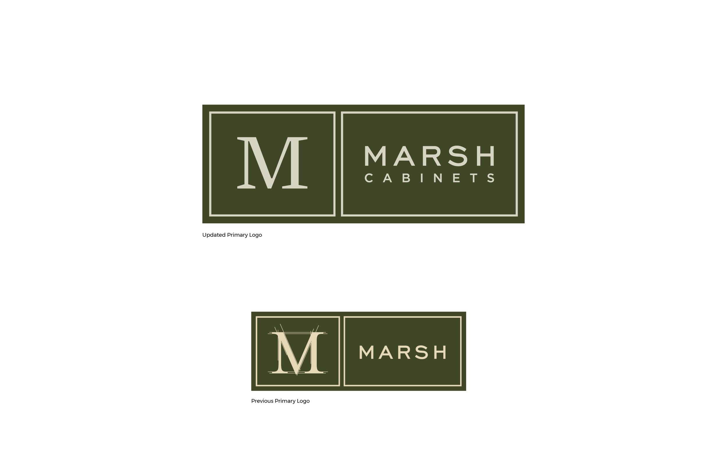
Marsh Cabinets updated logo and previous version
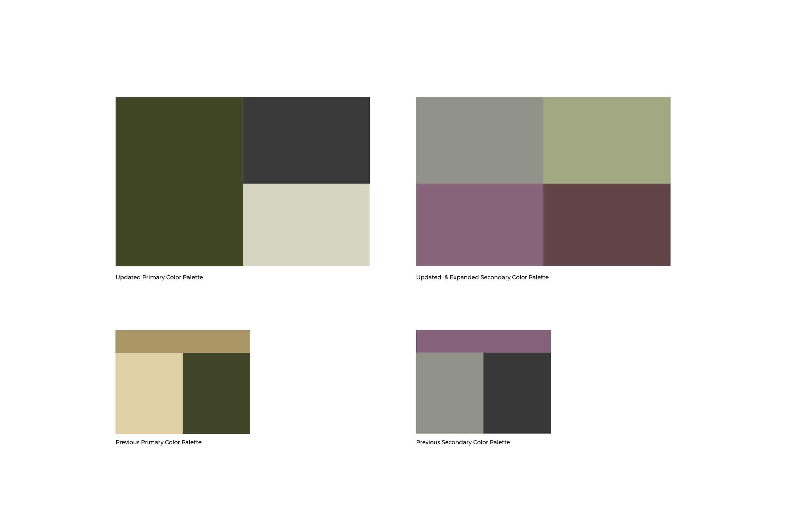
Revised brightened color palette
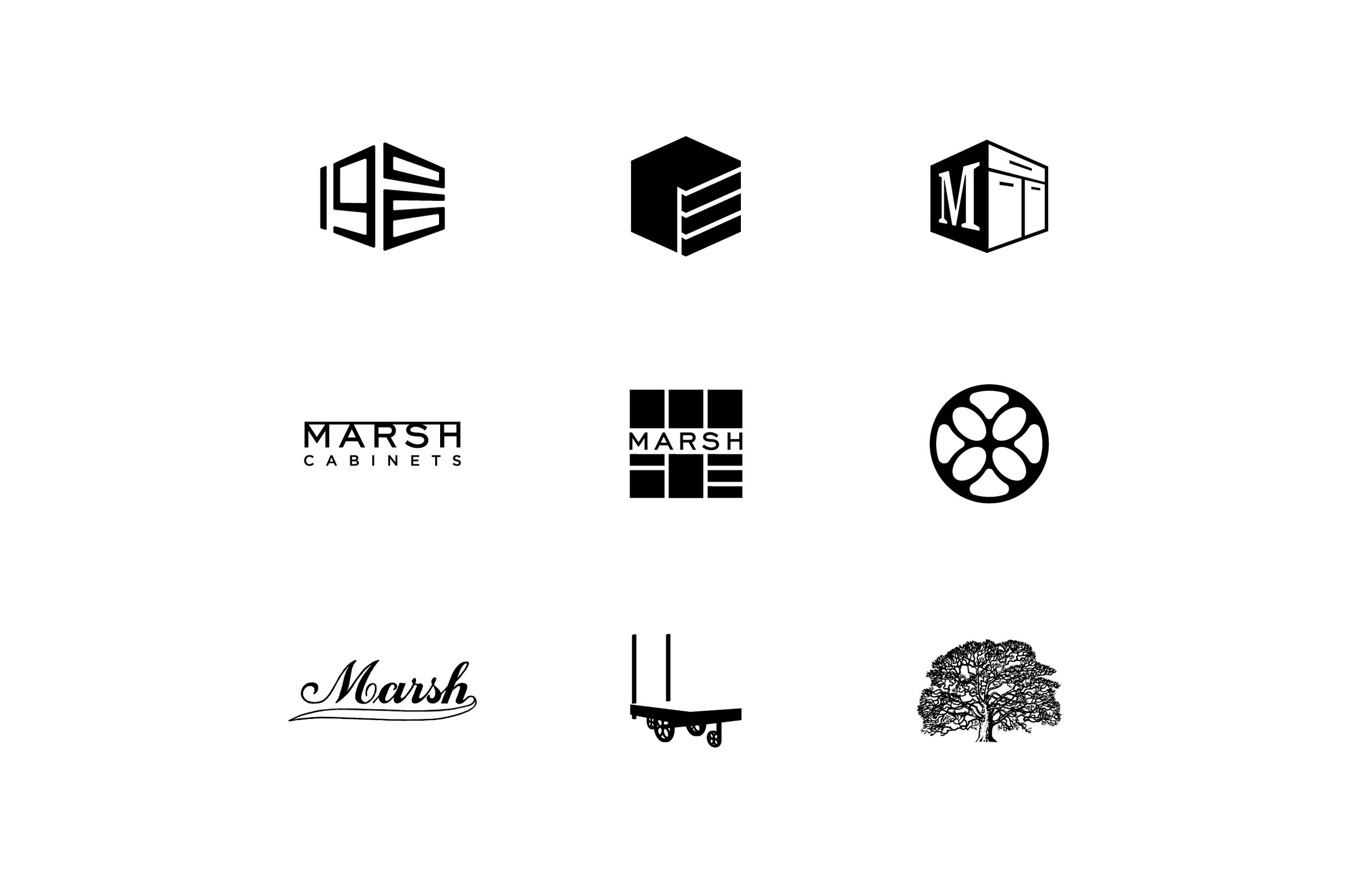
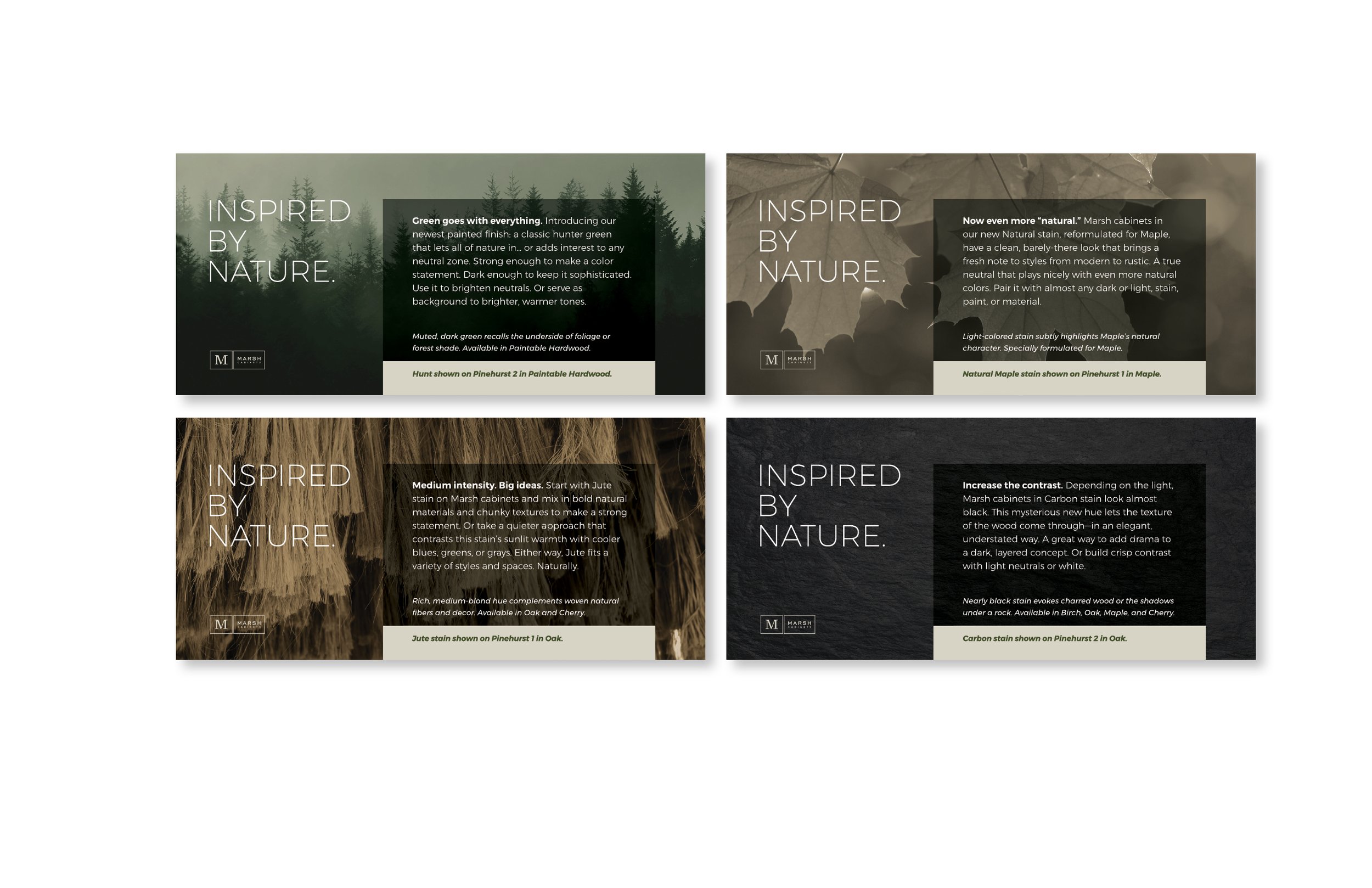
Iconic elements that help reinforce their products and help celebrate their 100+ year heritage
A sampling of the previous brand communications
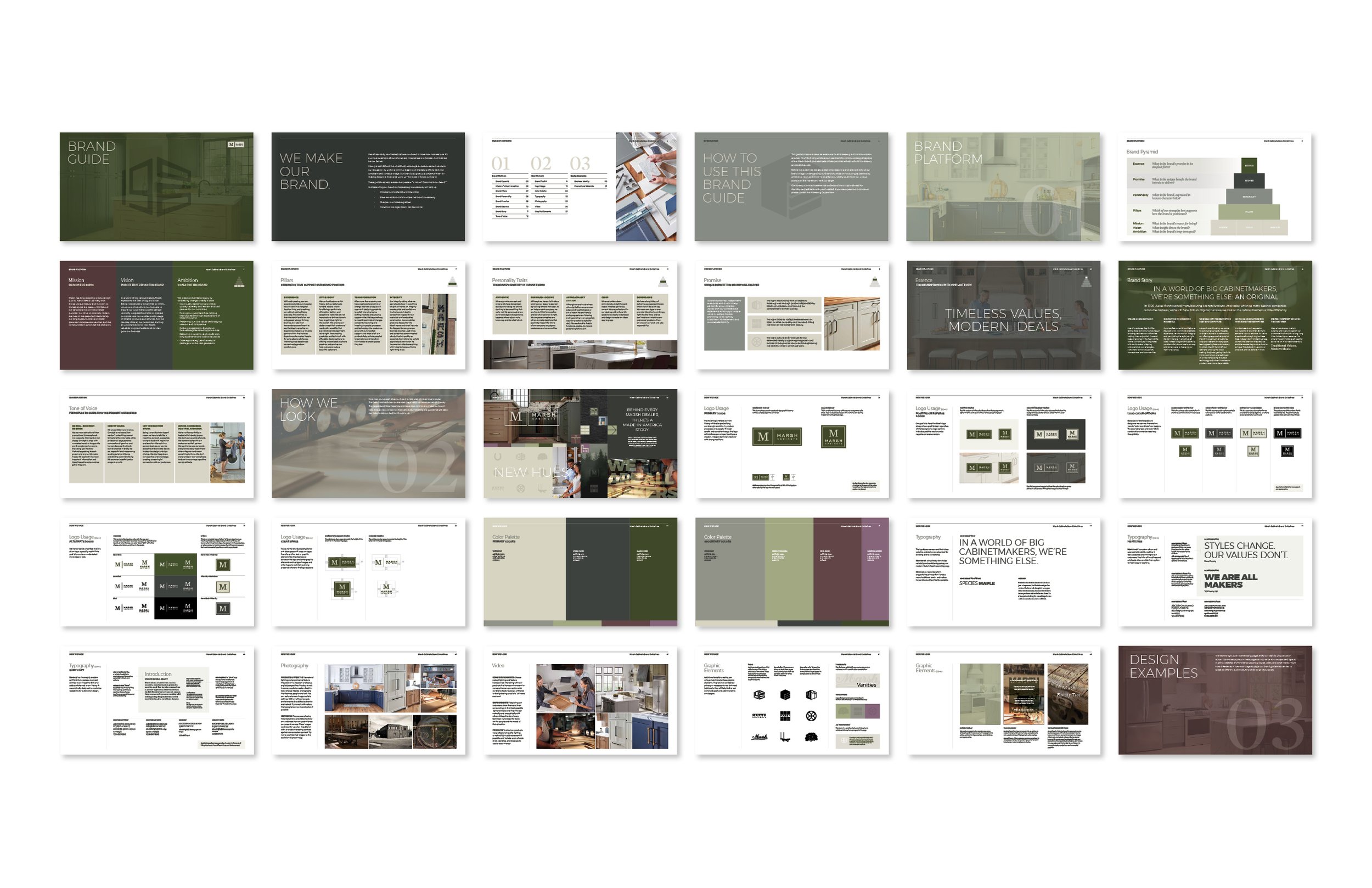
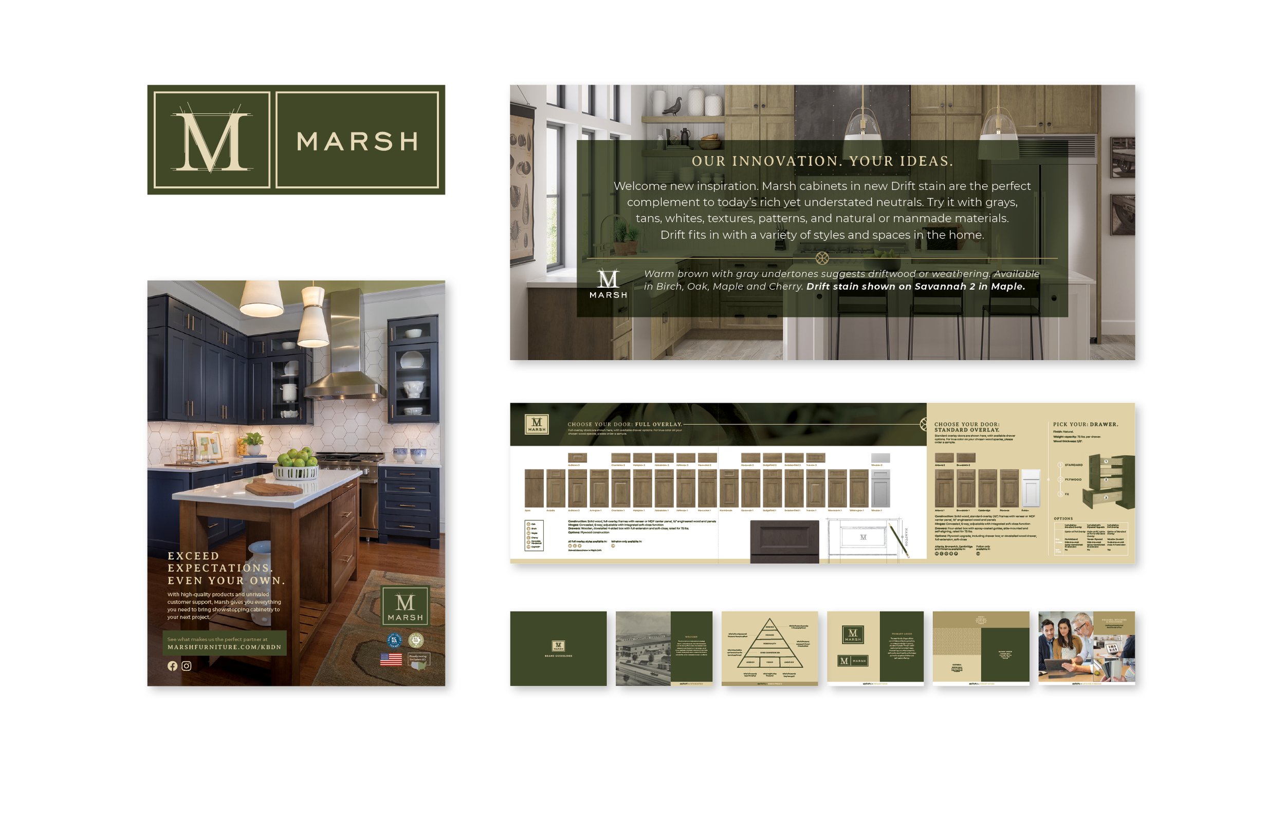
New brand vision and guidelines
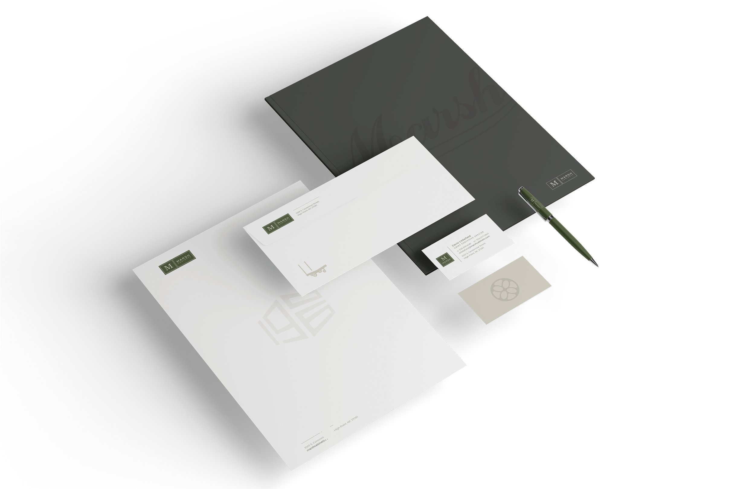
Updated stationery system
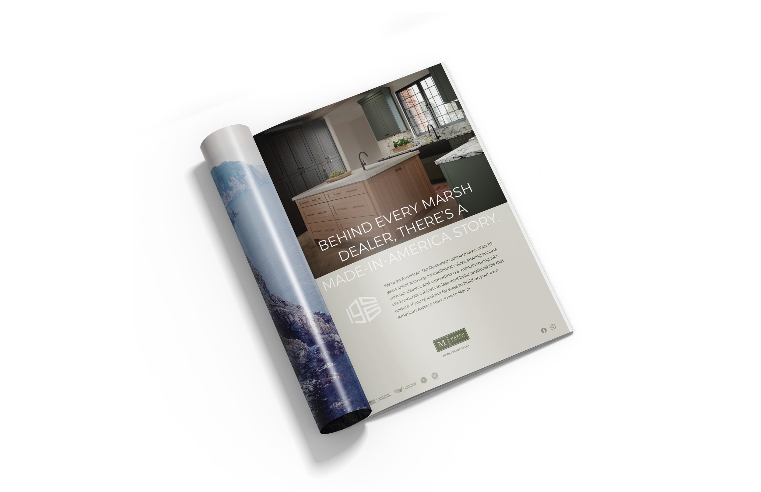
Trade advertising
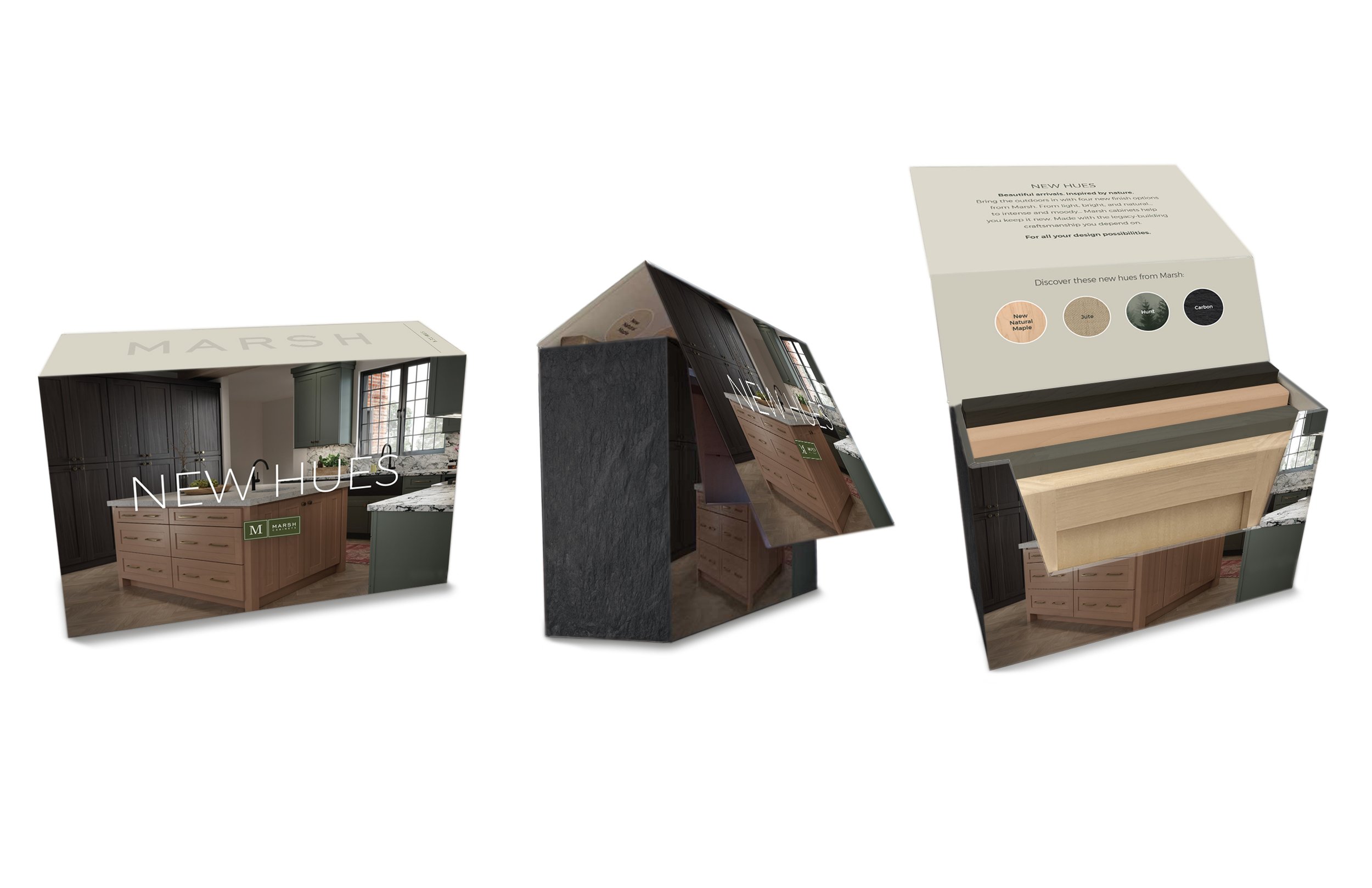
New Hues promotional box
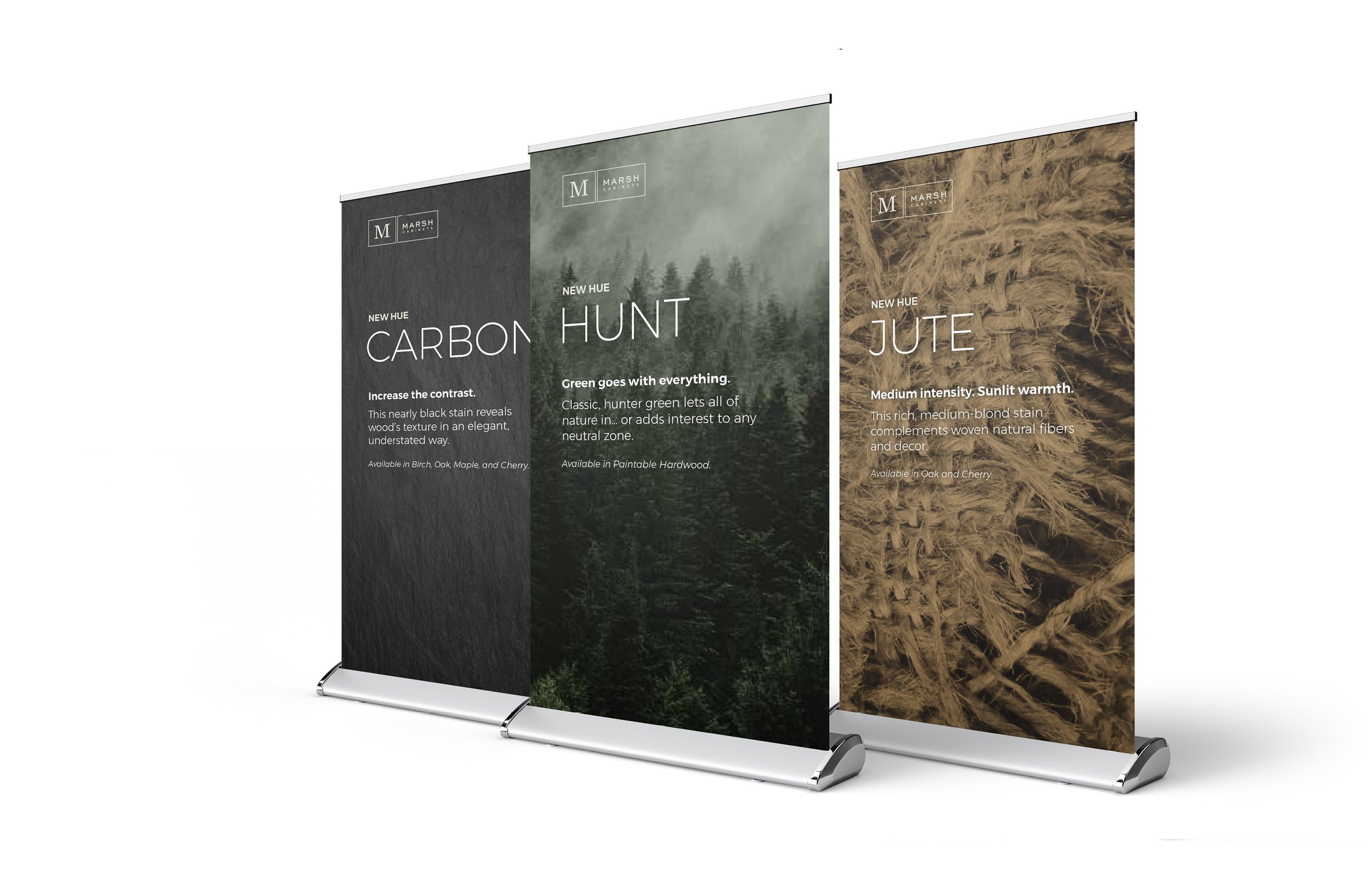
Sales Summit pop-up banners
Promo box labels
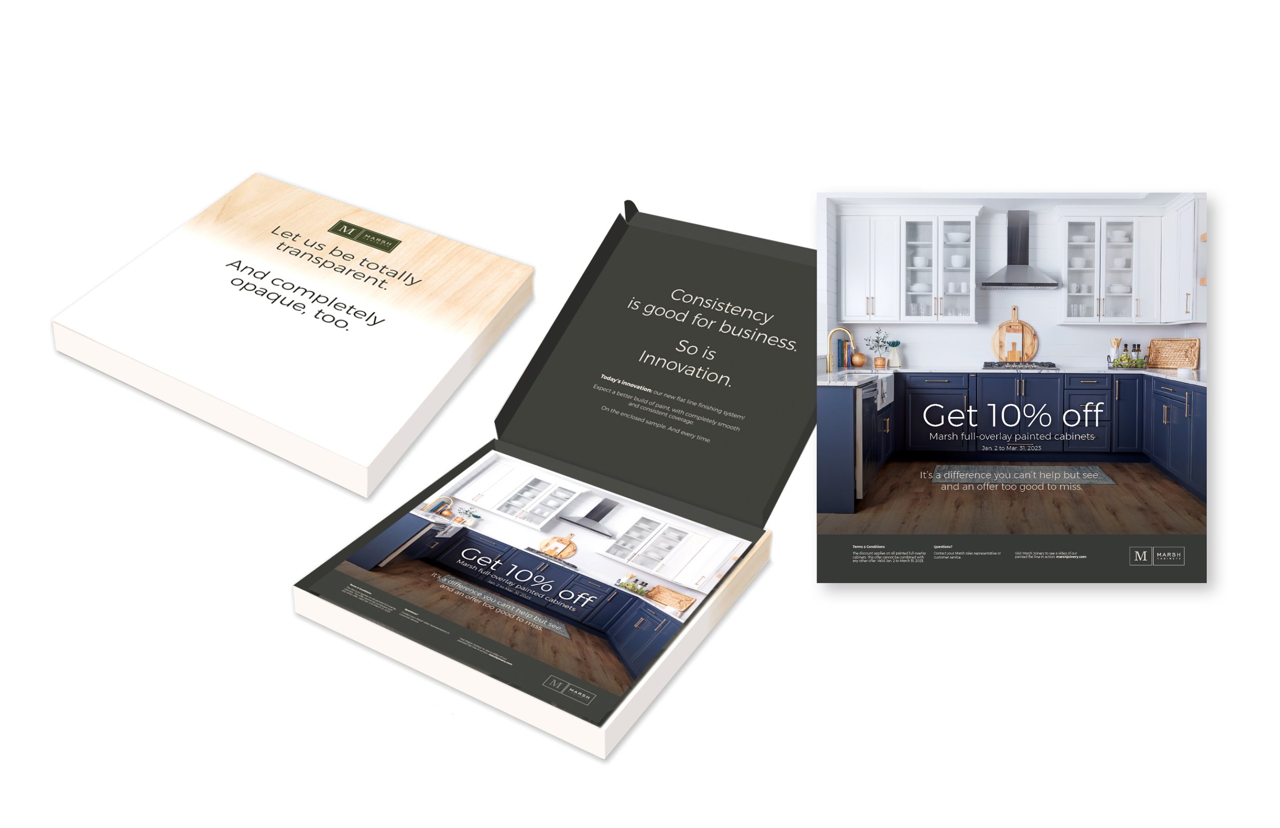
Direct mail kit